When: 2019
Role: UX Designer / UI Designer
Other Designers: Jake Geller (Daily Log UX Designer)
Engineers: Denny Oommen Mathew, Eric Klukovich, and Ron Haley
Tools used: Sketch, Abstract, Invision, and Zeplin
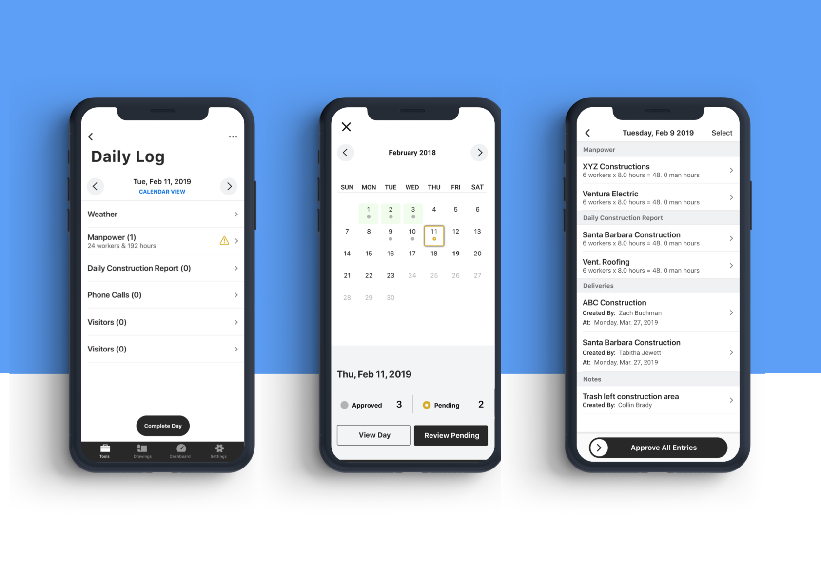
Objective: Design a calendar experience that would give project managers and superintendents a high level view of their approved logs.
Results: The improvements were launched 2019 and became the baseline flow.
The Daily Log Tool
About
• Fourth most used tool on mobile.
• Designed for teams to track workers, equipment, weather, notes, pictures, etc
• This tool will keep the pm or superintendent accountable for what happens out in the field on a given day.
Personas
• Primary - Project Manager
• Secondary - Superintendent
The Problem
Project managers and superintendents have to approve logs submitted by laborers so they can later close out that day and mark it as complete.
Project managers and superintendents might not approve logs on the same day.
Procore’s current experience is not designed for superintendents or project managers to easily go back and approve logs from previous days.
Strategy
Research
Internal research.
Discovery calls.
Audit current experience of iOS and Android.
Synthesize research to determine design exploration.
UX Design
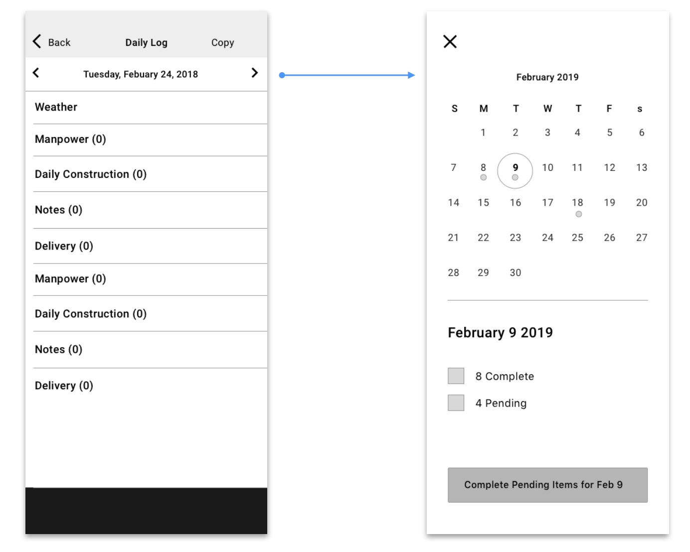
Low fidelity designs.
Wireless designs to help determine missing screens and components.
Research other calendar experiences available.
UI Design
Used new components from new design system.
Tested high fidelity mocks.
Made iterations based off of feedback.
Final design handoffs.
Audit
The Flow
Before designing anything I created a simple a task flow of the existing experience to the collaborator and approver experience
The Audit
I took screenshots and mapped out the current experience so I could identify current pain points and opportunities for improvements.
Identified problems: N°1
User can only click back and forth to view days with unapproved logs.
When they need to go back more than 1 or 2 days, they have to tap the “back” button over and over.
Identified problems: N°2
Users could only approve all entries on the list view. But what if they wanted to approve 40 out of 50 logs?
The only way was to go into each individual log and approve manually.
UX Principles
When designing I kept in mind Procore’s core UX principles.
One is making sure the user feels like they are always in the driver’s seat and
in full control of the app.
Another is using helpful contextual clues to guide the experience.
Finally, we aim to use simple, everyday language to communicate with a down-to-earth customer base.
Inside Out
• Understand how calendars are used in other apps.
• Learn proper interactions for calendar experiences in mobile.
• Layout and organization
Design Exploration
Proposal N°1
The direction I decided to continue exploring.
Repurpose the current calendar experience.
The user can still click back and forth but the center date would trigger the new calendar experience.
Concerns
Discoverability.
Using Wireless Designs
• Once I had a direction I began creating wireless designs that would help me identify missing screens and components necessary for a seamless end-to-end experience.
• With my team we created many iterations. We had a strong understanding of users intention and goals, we just needed to fill in the gaps for a successful experience.
Discoverability is key
Since we were going to repurpose the current calendar component I wanted to ensure that users could discover it.
Initially I had decided to move forward with option 3, but I noticed during testing that users seemed to still miss the calendar button. I then changed the design to option 4 and saw
an improvement of users quickly tapping CALENDAR VIEW.
Narrowing and refining
Visual indicators
There were some existing visual indicators from the web app that I had to adopt for the calendar experience.
I wanted these indicators to have a second purpose as well. When a user were to click on a day the button should help guide the user.
Final design
Final Calendar Design
We were currently implementing a new design system and I explored different options. I went with this option because it was simple, clean, and best represented our new system.
Challenges
Different iPhone screen sizes created some challenges we needed to address. The design intention was for everything on the screen to fit. Allowing the screen to scroll could result in information being missed. We had the design resize for devices smaller than a
iPhone 7.
1. Clear end-to-end navigation.
I created many task flows and user flows to identify any gaps
to the experience.
2. UI should guide the user to success
We hope that once released this experience will help our users that struggle learning new interactions.
3. User should have control
Now when pms or superintendents go to approve their logs they will now have the ability to select the logs. I modified the swipe to close button to also guide the user.
4. Onsite visits and testing
I made 3 visits to three enterprise size clients in Oklahoma City and Dallas, Texas. The superintendents I met were thrilled to hear about the new experience, and they confirmed that they 100% needed this experience on mobile.
Final Flow
What was achieved?
Users have the ability to bulk approve and individually approve entries.
They now have a high-level view of the status of their entries and can efficiently act on them.
There is clarity to every step the user makes.
The UI is closer to meeting accessibility standards and is using the new components of the design system.


