


When: 2022
Role: Product Designer
PM: Eric Sacks
Content: Anthony C.
Tools used: Figma, Usertesting
Objective: Reduce abandonment by targeting customers that might be facing FUD fear,
uncertainty, or doubt).
Results: A total of 47 million (focused on conversion) customers initiated their tax filings with TurboTax, out of which
4.2 million were identified as at-risk. Following this, 1.3 million customers were exposed to
an intervention, and 108,000 of them engaged with the intervention.
As a result of our strategy, which included launching targeted interventions, we were able
to reach a higher percentage of customers. This resulted in 108 ITPY*, +280K customers.
Context: Reduce abandonment
In the tax year 2020, a total of 48 million first-time and returning filers initiated their tax returns through TurboTax. However, 10 million customers abandoned the process at some point.
Goal
The primary objective of this initiative was to reduce customer abandonment. As part of a broader effort led by NLAC (Never Lose a Customer), we identified areas with high rates of customer abandonment due to fear, uncertainty, or doubt (FUD)..
How?
As the leader of this initiative, I spearheaded the implementation of Expert Interventions. We identified customers who were struggling at any point in the tax preparation process and offered them assistance from a product specialist or tax expert at no additional cost.


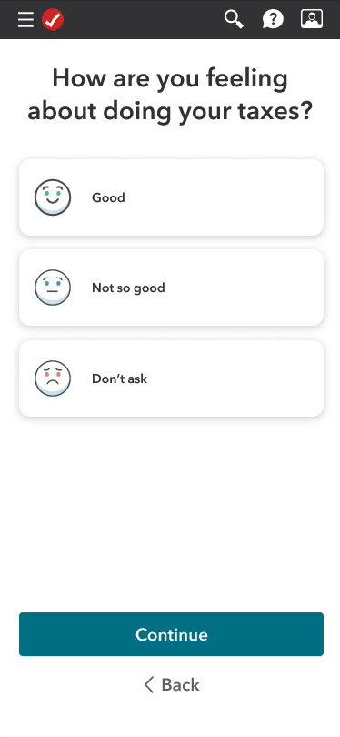
Customer problem
I am a TurboTax paid DIY customer
I’m trying to finish my taxes
but I’m confused about a specific area,
despite all of the
on-screen explanations,
because I don’t get how it all applies to me, personally,
which makes me feel like I’m on my own, and I’m not confident
that I will get my correct refund.
Targeting:
• At risk of abandoning.
• Qualifying customers: DIY customer (Free, Premier, and Deluxe skus).
• Disqualifying: TurboTax Live customers.
Design Strategy
Component strategy
To facilitate rapid experimentation and easy implementation, I utilized several existing messaging components that were available. Additionally, I relied on research and data to identify new opportunities that existed beyond our design system and proposed them for implementation.
Triggering intervention strategy
Creating early awareness.
Target customers stuck in a loop.
Add rules for topics that have high abandonment. (In prototype).
Personalization.
Creating awareness
Our aim for new paid DIY users is to provide them with easy and persistent access to chat as well as awareness of its availability. Unlike chat interventions, this is a non-targeted approach.
Content Strategy
Generic: for all customers at any phase of tax filing.
Targeted tax topics: target areas we know have high abandonment in specific tax topics.
Target emotion: Spending more time than necessary or we identify they are stuck in a loop.
Process to success strategy

Usability design principles
Relevance
Only send interventions that matter to the user.
Selectivity and Differentiation
The intervention should be worth the cost of the customers attention.
If they are not differentiated they will get ignored or be considered annoying.
Actionability
Notify target interventions at a time
when they are able to take action.

Going broad/Brainstorm
Participants:
Visual design, Content, and Product
Goal: Collect as many divergent ideas that would help influence
strategy, interaction, and design.
Outcome: 4 themes
Make me feel prepared.
Toss me a lifesaver I need help.
Inform me, don’t overwhelm me.
Give me bite size tips.
Round N°1 of testing/Create awareness + targeted interventions
Goal
Gain learnings on customers reaction
to experiencing two interventions.
Testing method
Tested two recipes by doing unmoderated Usertesting.
Watch outs
One customer was annoyed which aligned with the design principle
Selectivity and Differentiation.

Recipe_01
Recipe_02
Awareness
Removed confusing CTA after noticing customers were confused by CTA and close button.
Intervention in product
Testers were delighted by second intervention when they noticed there was an issue.
Adding a Learn more
Learn more has a 1% engagement in product.
Learn more Modal
Testers thought the additional information in Learn more was valuable.


Exploring opportunities to raise awareness TOF
• Focused on doing more divergent design exploration.
• Intention to raise awareness of benefit early in the customer journey.
• These designs also went through a round of Usertesting.
• Although these bolder designs performed well in Usertesting, we decided to revisit these later and
deliver an MVP that allows us to meet our deadline and achieve our goal.

Embedded / Make me feel prepared
Designed to live at the end of Get To Know Me/onboarding.
Would be added on the end of the summary screen.
Delightful, informative, without being intrusive.


Immersive / Make me feel prepared
Designed to live at the end of Get To Know Me/onboarding.
Full screen right after Get to know me summary.
Intended to be more immersive.
Delightful animations.


Peak-A-Boo / Give me bite size tips
Designed to live on the tax dashboard right after completing onboarding and before starting PI.
Intended to be a small snack-a-ble pattern.


Narrow and finalize design
In the end I narrowed on a flexible pattern, that could scale, be used for the different
target points, and could be easily implemented to meet our deadline.
We released targeted content specific to each use case.
Generic content: for all customers at any phase of tax filing.
Targeted tax topics content: target areas we know have high abandonment in specific tax topics.
Target emotion content: Spending more time than necessary or we identify they are stuck in a loop.
From To
This was a net new experience, therefore there was no from.


Documentation: Design specialist, tax expert, mobile web, versus native.
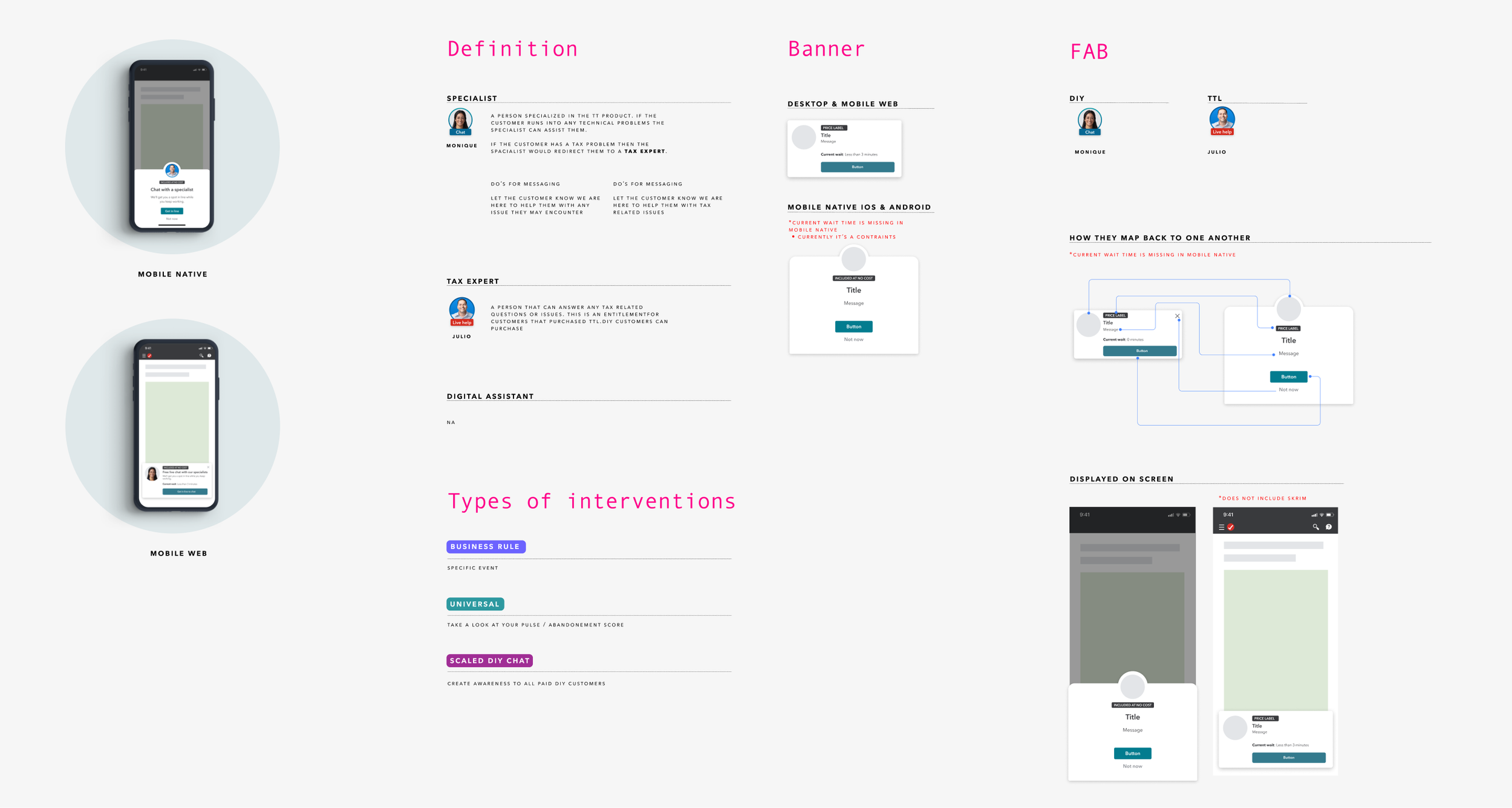
Documentation: Flow and interaction

Documentation: Location for each pop up.
